
 image by ehmeelu on flickr
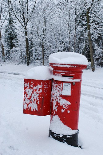 image by becksldrt on flickr
 image by sludgegulper on flickr
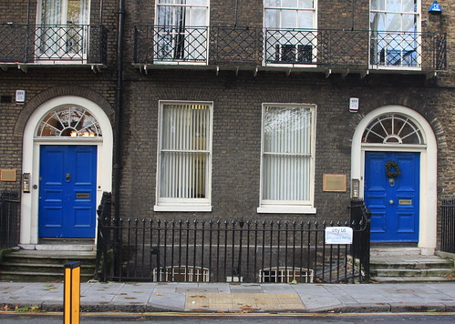 image by barberdavidm on flickr
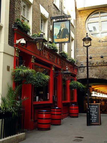 image by Kake Pugh on flickr
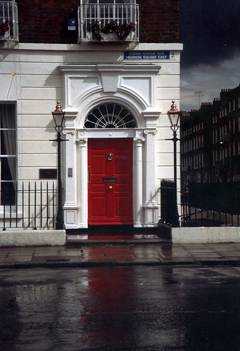 image by Francob65 on flickr
 image by Greg Grabinski on flickr
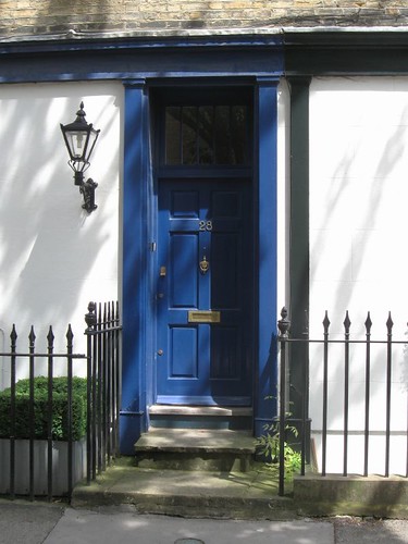 image by nicksarebi on flickr
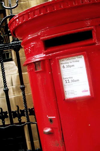 image by -infamous on flickr
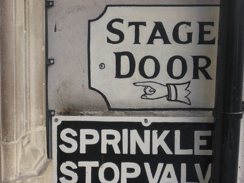 image by AndyRob on flickr
 image by Ducklover Bonnie on flickr
What I love most about these images is that it's so easy to see a strong colour palette coming through already. The next challenge is to find a way to work with red, white and blue that hasn't been seen a million times before... I'll definitely use touches of grey and black to make it more 'London' (for some reason when I think of London, I think of glossy black paint), and I might even experiment with including dark green.
6 comments:
Love the bold colours in the pictures you've chosen, against the white purity of the buildings! Where are you studying fashion?
PS it's helarious from frankie ♥ :)
these definitely capture an original essence of London. they make me wish i was back there...
...i just stumbled across your blog, i like it very much! the ship and shovel pub is right next to where i work!
Thanks for the link to my photo!
lesdeux - thanks, but I didn't have to work too hard to choose the colours - London just IS those colours! I'm at UTS.
the maisies - thank you thank you! that's exactly what I want to do.
beastie - really? that's so cool! hope it's a good pub! (It's good looking anyway!)
ehmeelu - no problem, it's a great photo!
Oh great! I was going to nearly study there fresh out of HS but then made a last minute decision against. Who knows how things would have turned out! It is true, London does have very bold plain colours, it's still a great city though!
Post a Comment